01How do we reach customers?
I fixed the missed message and the dead end together
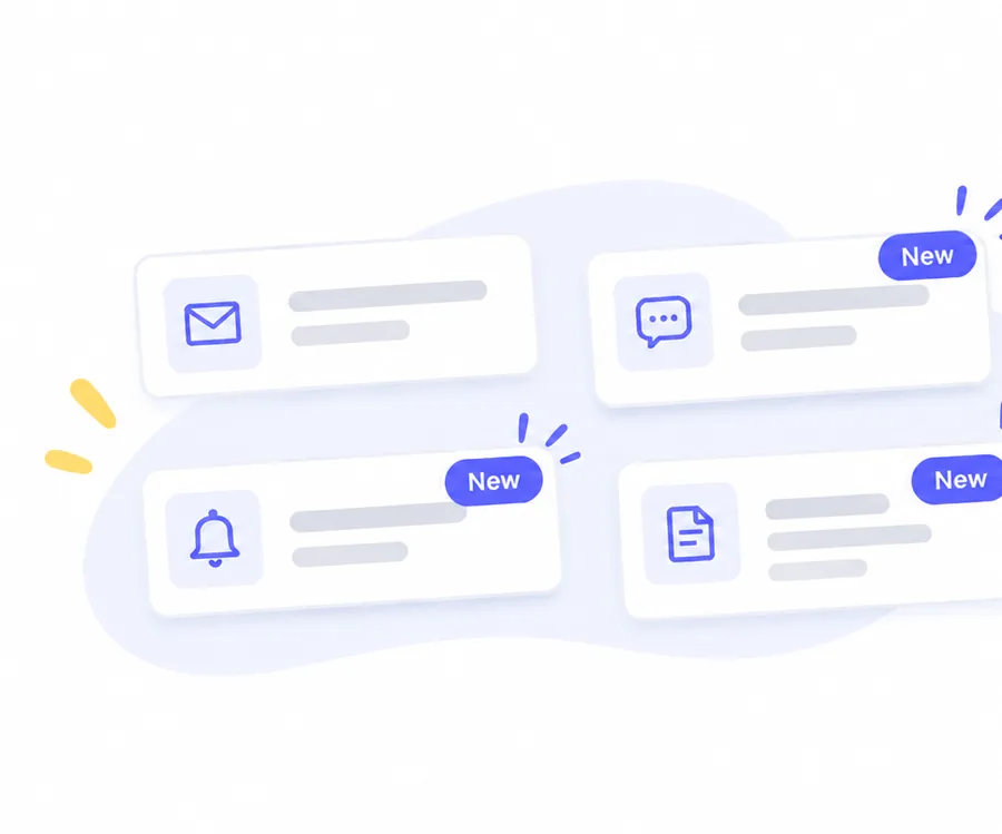
A better email alone would still land people on a canceled order. So I paired more ways to notify customers with a clear next step inside the app.
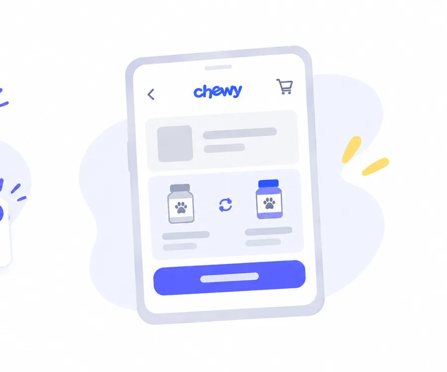

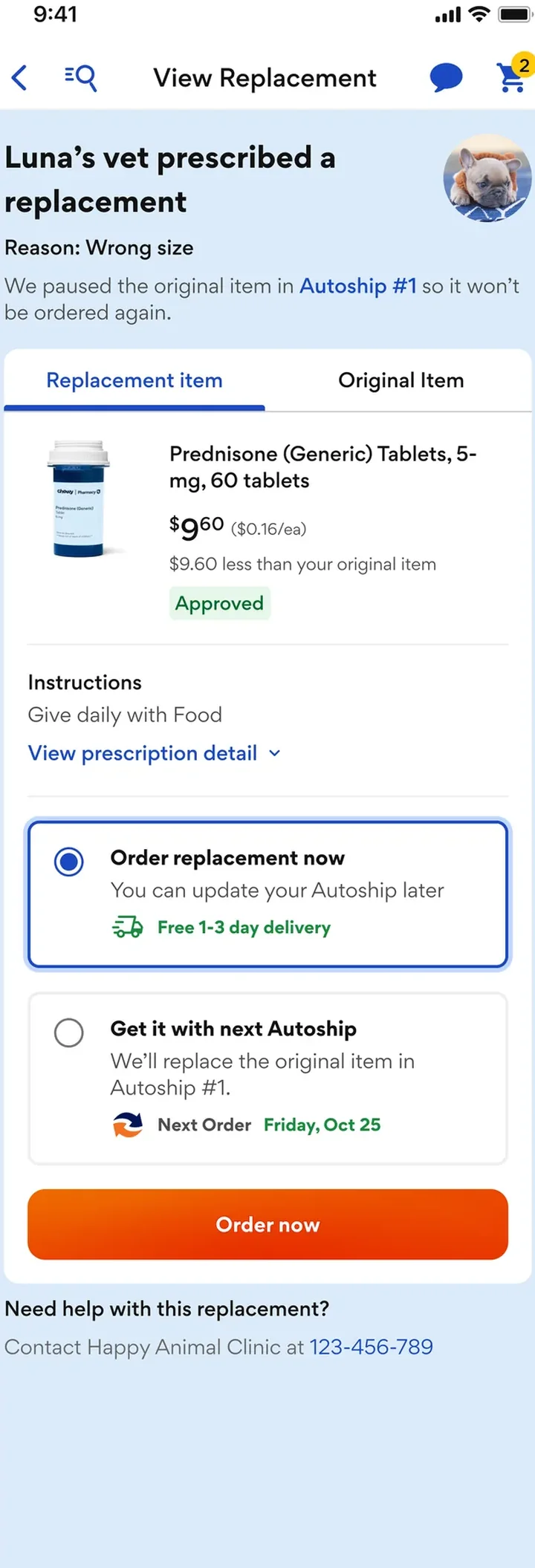
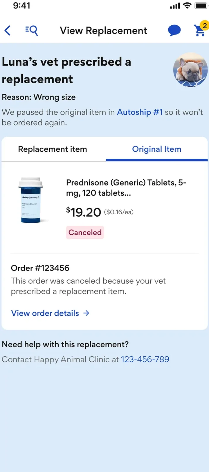
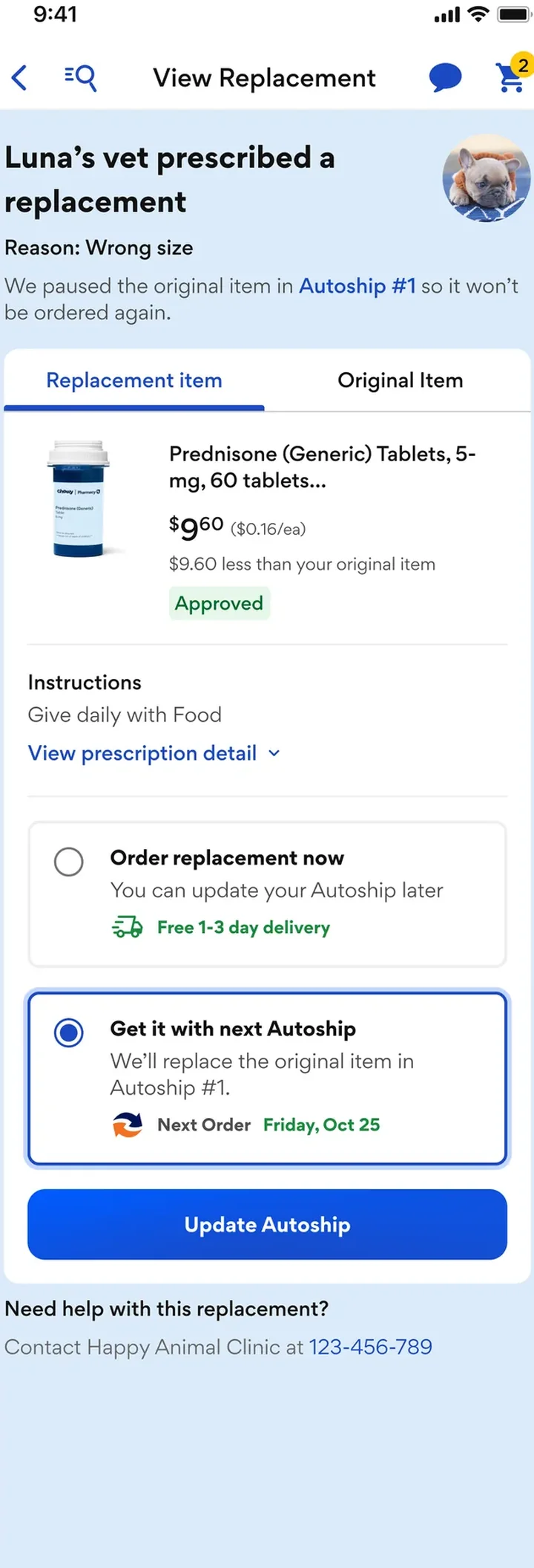
When a vet changed a prescription, the customer’s order just said “Canceled.” I led the design of a simple way to see the vet’s replacement and order it, right in the Chewy app.
Replacement
Original item
Autoship
The problem
Before · email only

 1
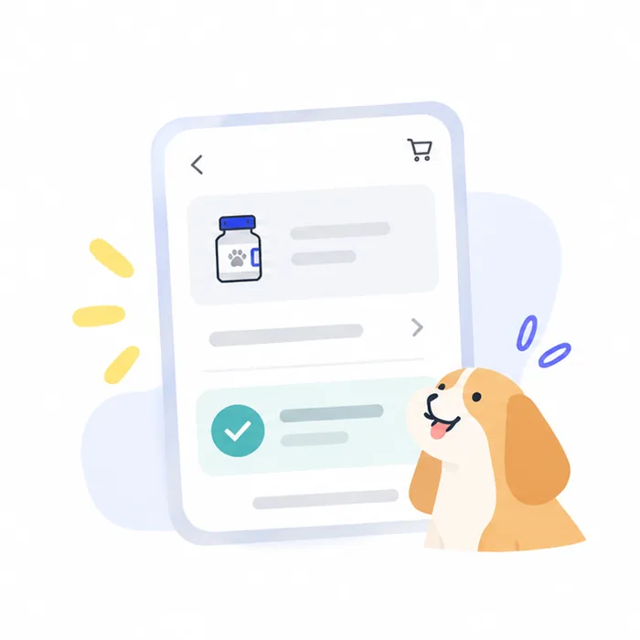
1Customer orders a prescription
 2
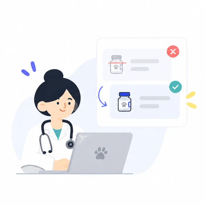
2Vet prescribes a different item
 3
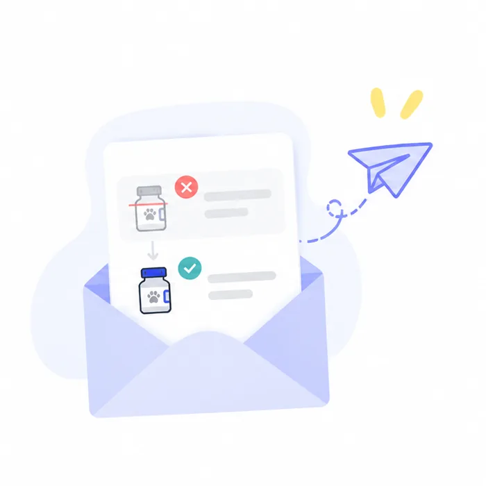
3Order is canceled, one email sent
The catch
“I didn’t see the email.” “I forgot to come back.” “My order just says ‘Canceled.’ What do I do now?”
My design goal
Key decisions
01How do we reach customers?
A better email alone would still land people on a canceled order. So I paired more ways to notify customers with a clear next step inside the app.
02When should customers decide?
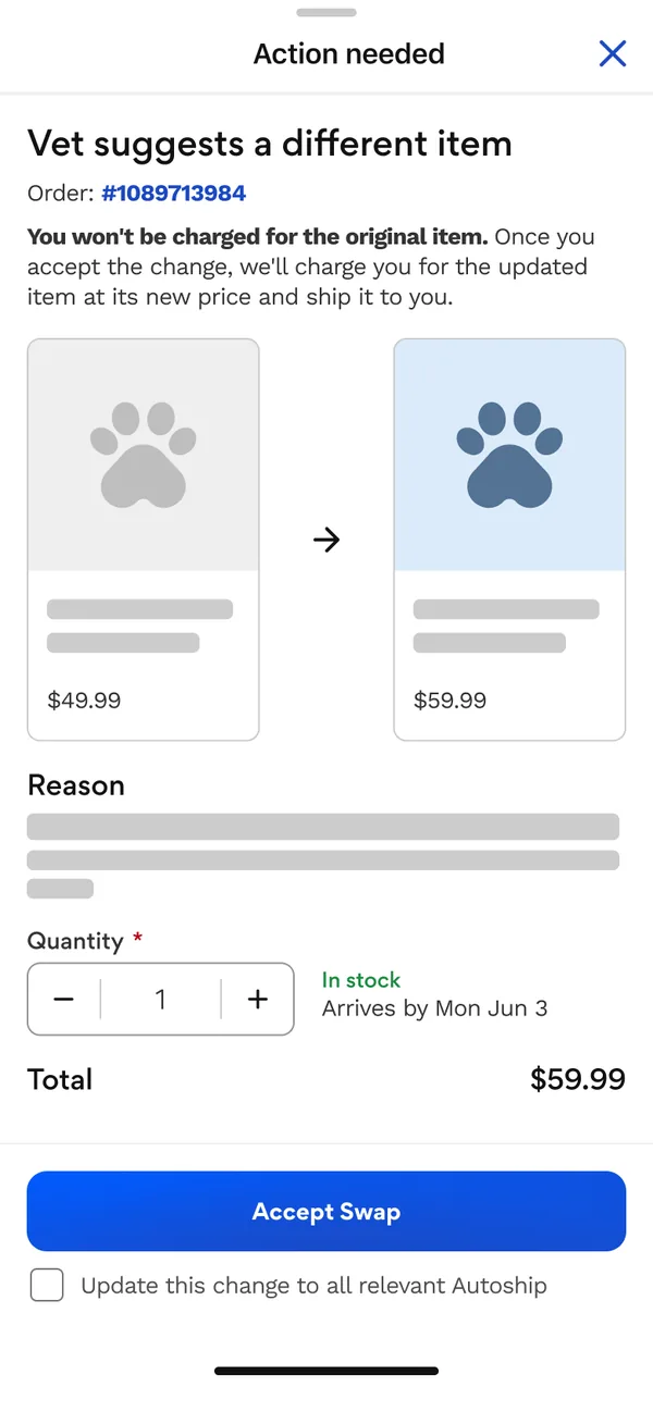
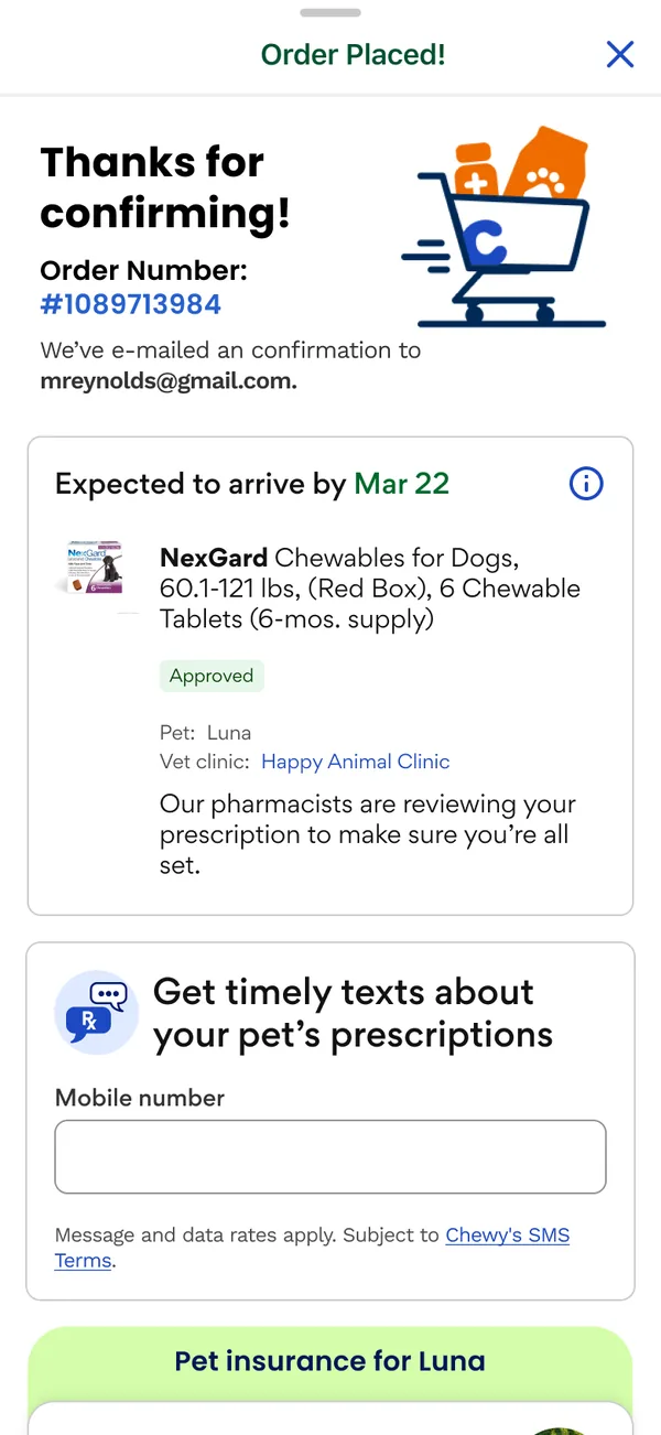
One idea asked for permission at checkout, before anyone knew what might change. I pushed for the other: show what the vet changed, then let the customer decide.
Not chosen · Ask at checkout

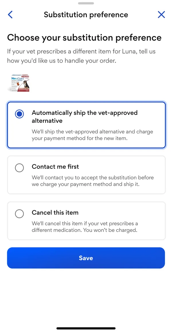
Chosen · Show the change first
03What should the screen look like?
The hard part was showing the new item next to the canceled one without confusing people. I tried four layouts, then chose one where the replacement leads and the original is one tap away.
Exploration 1
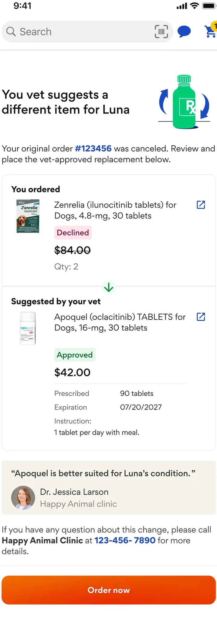
Exploration 2
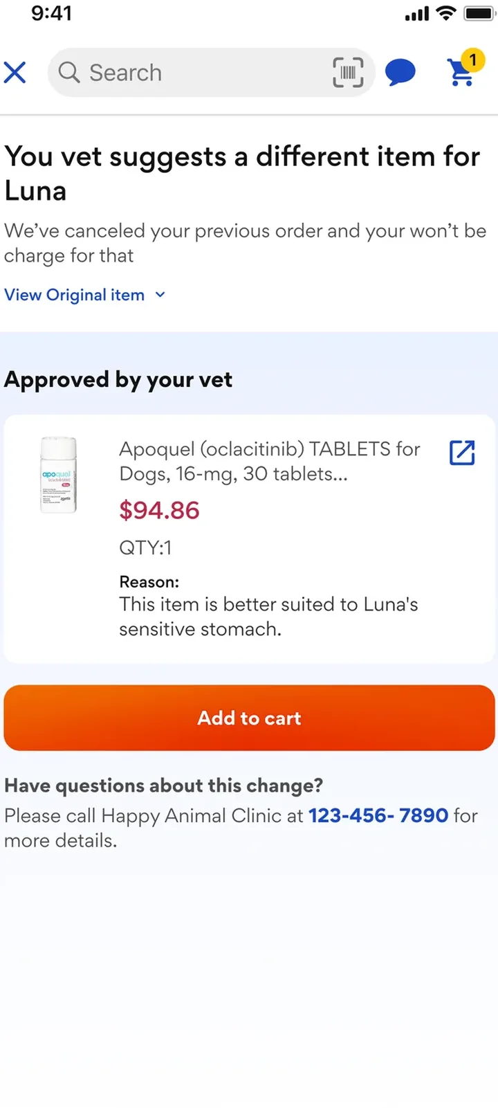
Exploration 3
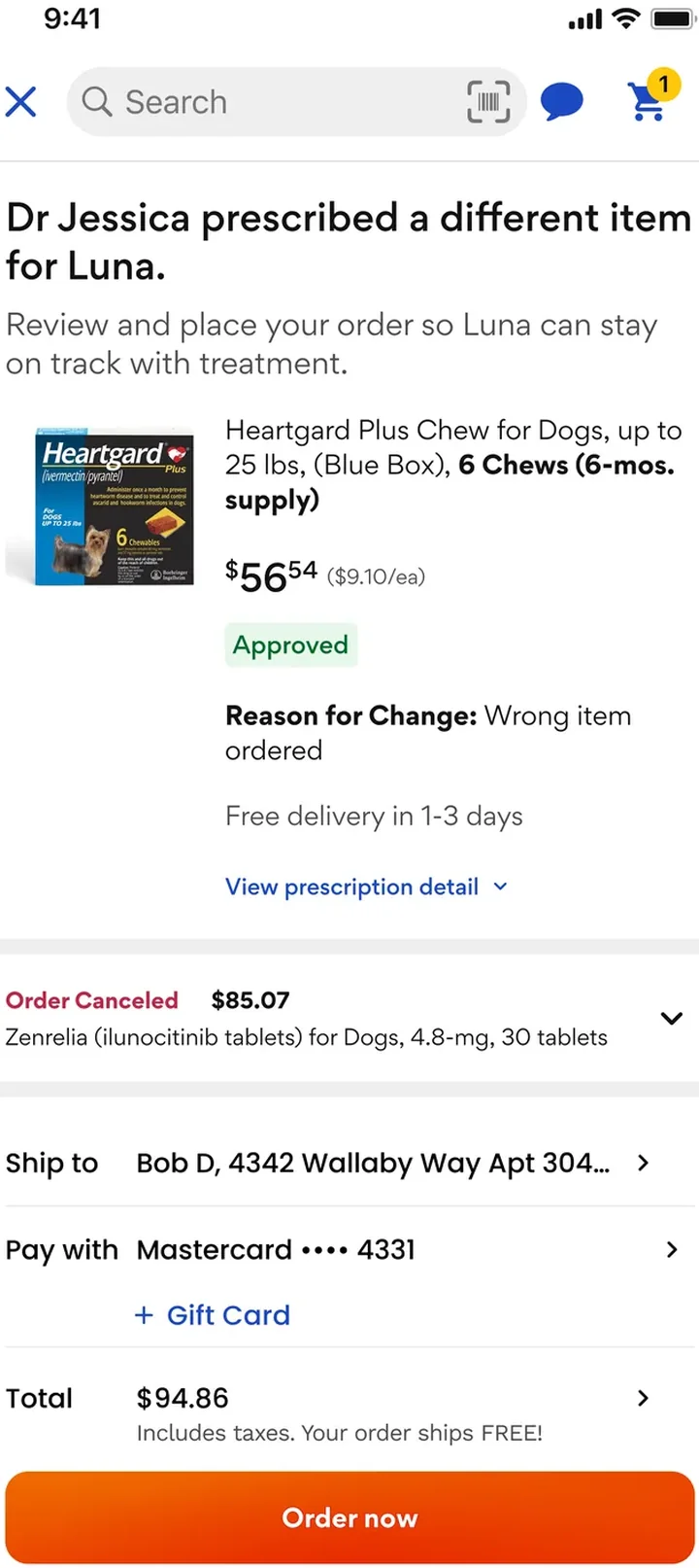
Exploration 4
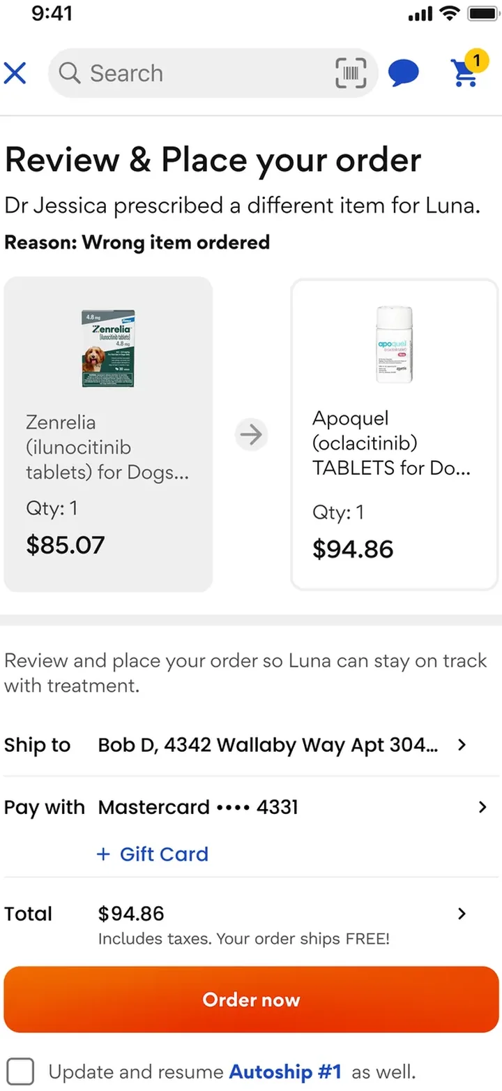
Selected
ChosenReplacement first — order it once or update Autoship, with the original item one tap away.
The solution
Before research
After research
Impact
e.g. replacement order rate
e.g. time to reorder